Full-screen vertically and horizontally centered text in CSS
This is as easily as adding one single div:
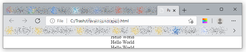
<div class="css-vh-center">
    Hello World <br />
    Hello World <br />
    Hello World <br />
</div>
and styling it properly:
.css-vh-center {
    position: fixed; /* or absolute */
    top: 50%;
    left: 50%;
    /* bring your own prefixes */
    transform: translate(-50%, -50%);
}
All the glory goes to this Stack Overflow answer.
Note that this is not using flex-box solution (see the above linked answer for details), so should work even in older pre-IE8 browsers.
The whole code in it’s simplest form could like that:
<!DOCTYPE html>
<html lang="en">
<head>
    <meta charset="utf-8" />
    <title>Page Title</title>
</head>
<style>
    .css-vh-center {
        position: fixed; /* or absolute */
        top: 50%;
        left: 50%;
        /* bring your own prefixes */
        transform: translate(-50%, -50%);
    }
</style>
<body>
    <div class="css-vh-center">
        Hello World <br />
        Hello World <br />
        Hello World <br />
    </div>
</body>
</html>
Note that this is a strict and absolute positioning. Meaning that if the content will be higher than your browser window’s height, it will be clipped:
And no vertical scrollbar will appear.
So this is more like for vertical-and-horizontal centering of a single or just a few lines rather then doing the same with the content that can be scrolled.