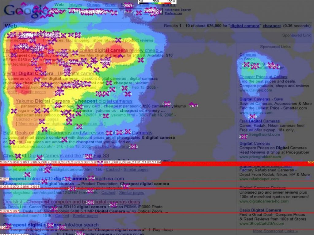
Hot areas on your website
Today I have came across Piotr Konieczny’s presentation on Google SEO Hacking and I found page 60 out of it quite very interesting. It includes map of ho areas of your website, that is places, where your visitor’s eyes are placed at first and where they stays the longest period of time.
It is taken form Google and is made purely for SEO, but you can also use it to enhance design of your website, i.e. put the most important elements of your layout there, where they will be found fast and for sure.
Here is that map:
Try to design your website in the way, that most important parts are as close to red areas as possible.
Very common elements of your page (such as login form or widget), especially when not used every time (most users wants to be logged-in after they close browser) will always be easy to find, after a few visits, so they might be moved to more “cold” areas of above diagram.
